SKY ZONE

They Said
Since Sky Zone launched in 2004, copycat competitors have been popping up left and right. Imitation may be the sincerest form of flattery, but we’re not flattered. How can you help us maintain our position as a category leader?
We Said
Sounds like differentiation is in order. We’ll research the best target audiences to expand your customer base and drive long-term growth, then build a full rebrand strategy based on that. We’re talking brand positioning, creative content, a website redesign, the whole shebang.

The Branding
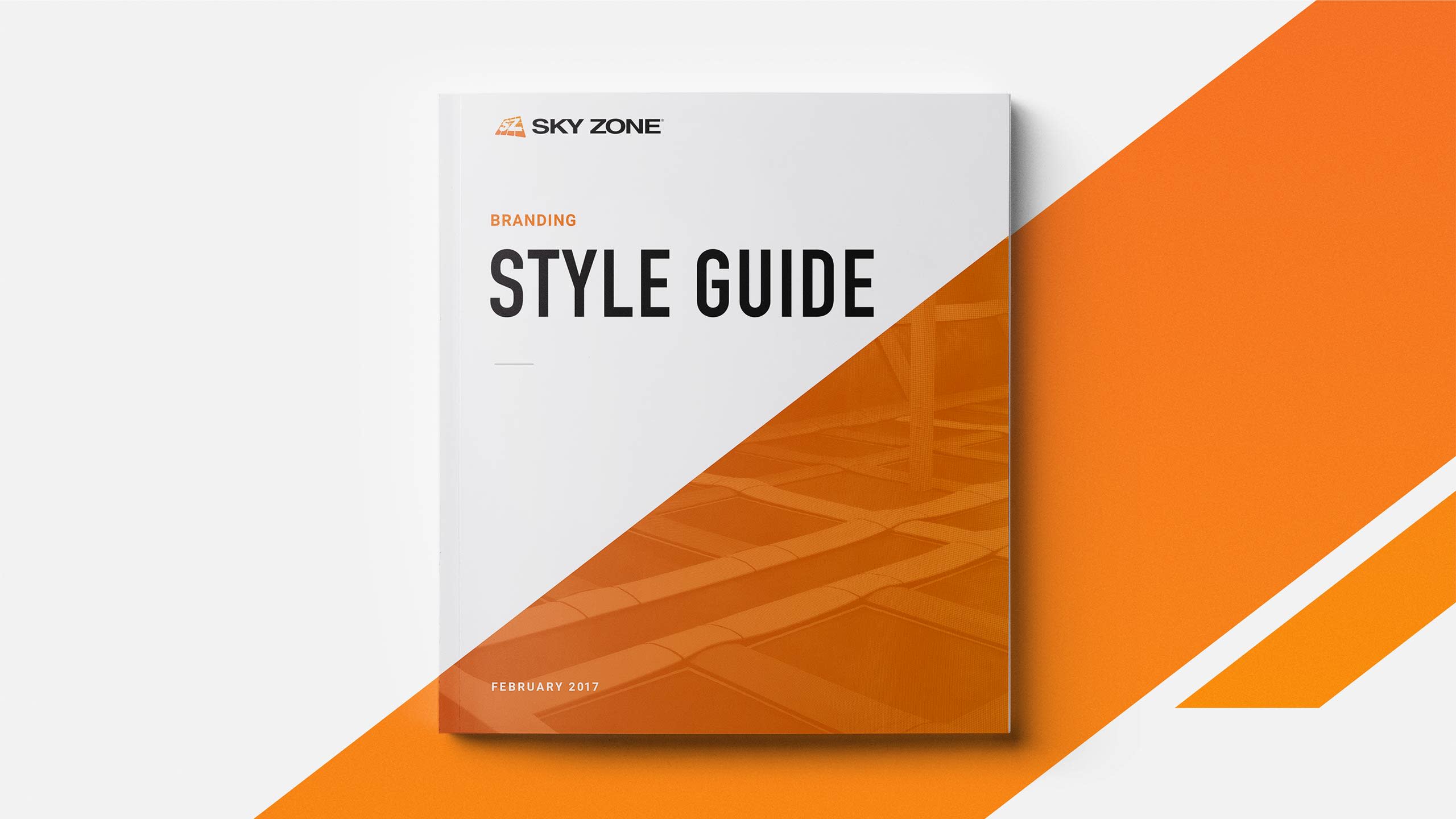
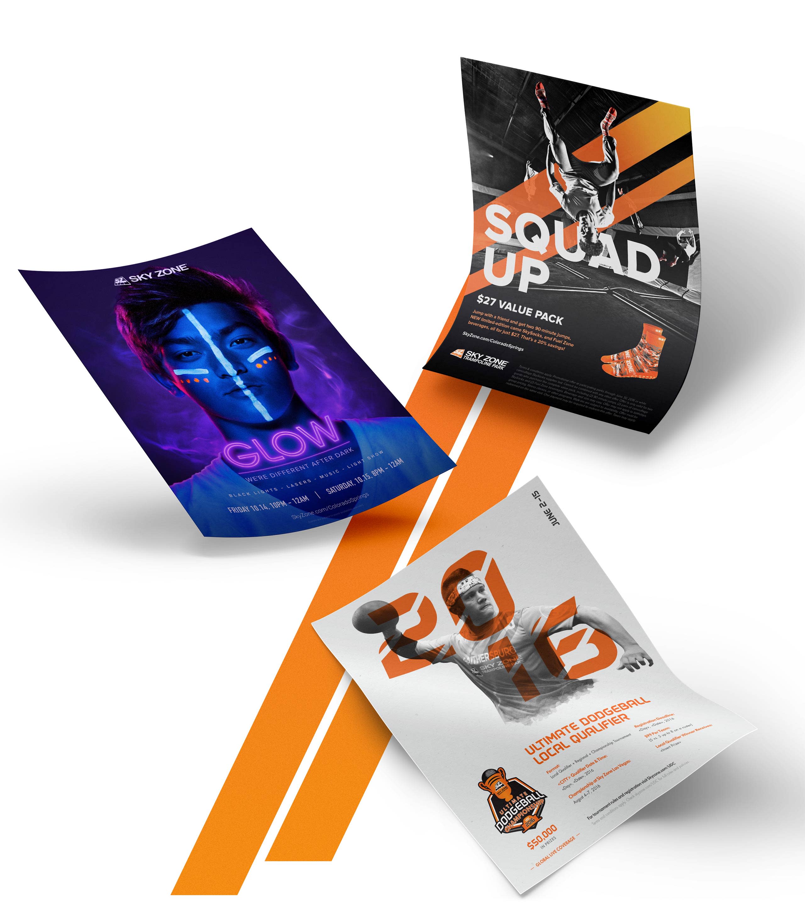
Once we established brand pillars, we set out to build an identity. Orange became the striking and energetic color we would own, while the Sky Zone voice was confirmed as being active, engaging, and impactful.


The Website
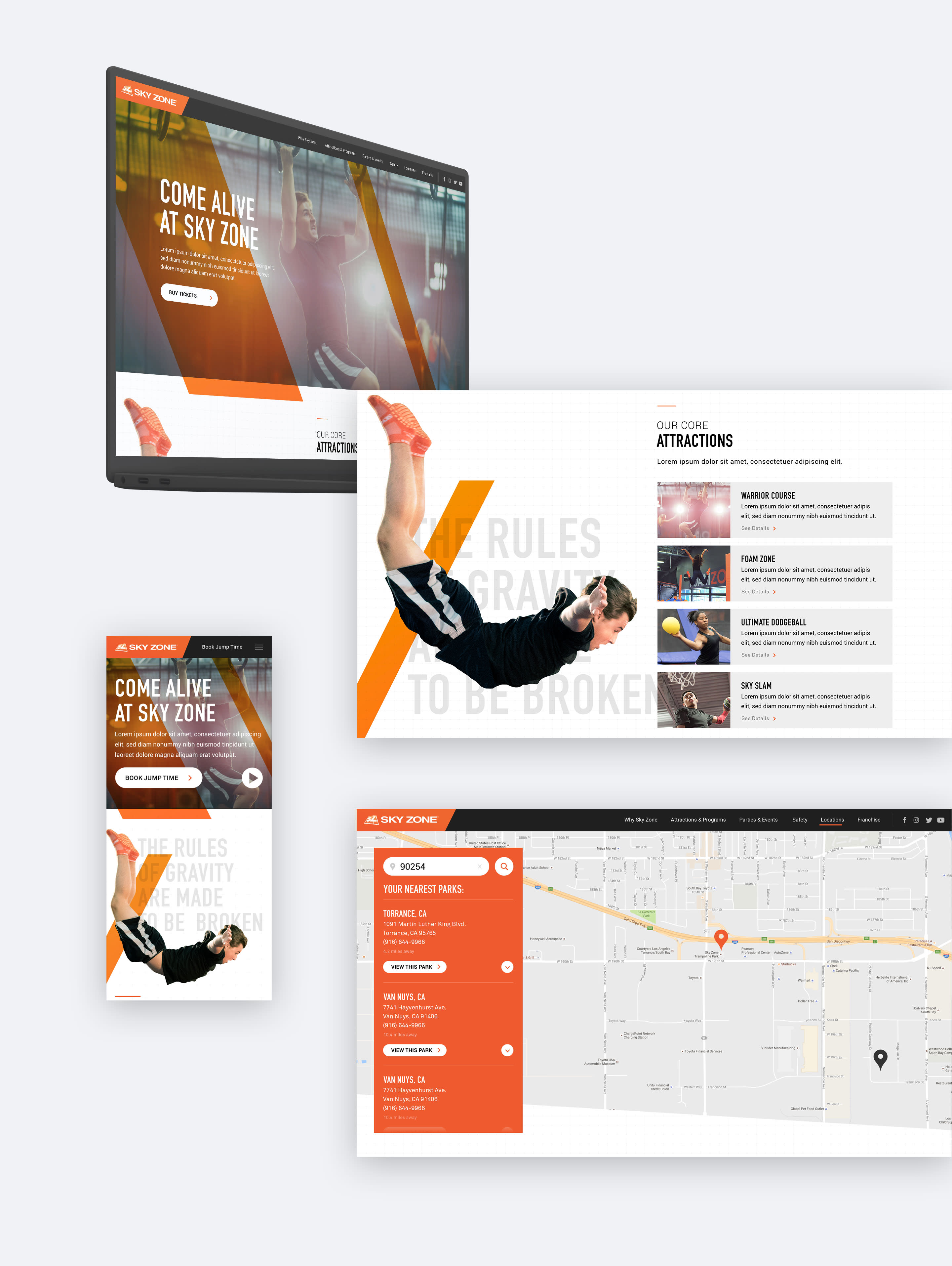
The website we created used parallax animation and video to bring the in-park experience to life. Our custom content management system was designed dynamically on the backend so individual franchise owners could easily edit information for their specific locations. We kept everything lightweight to ensure the website would remain responsive and high-quality and require minimal server load.

The Insight
We’re selling an experience. We need to define the brand using pillars that will unify everything we do going forward. Bold, energetic, active––the website and the creative will directly reflect how people feel at Sky Zone.
Best of All, It Worked
Within a year of the rebrand, park sales and website conversions increased dramatically. Sky Zone has helped thousands of people reach new heights, and we were thrilled we could do the same for them.